Table of contents
Introduction - Have you ever been in front of a blank page ?
Yeaaaaah this is the feeling I'm talking about: this void you have to fill, this immaculate sheet you need to stain, this frightening emptiness you are staring at, the blank page. You have probably already faced it, be it a sheet of paper, words that don't come to your mind, or in our (rather specific, I know,) case, your personal website.
In this guide I want to give tips about coming up with the content of your personal webpage. Styling your website is something covered in many guides, and you can find plenty of inspiration just by lurking at other sites. + I think it's a lot more fun to fiddle with css for hours. But when it comes to writing some material, I'm back to school writing an essay, like what the hell this isn't school I should be having fun urgh
Anyways I hope this will prove to be helpful, happy creating your online home !
The "obvious" - What's obvious isn't always obvious
This is your homepage, so it reflects who you are. This space is yours, it is your home, it is you. You can always start by presenting yourself, or whoever you want to be for the online neighborhood (but trust me, being yourself is better). I don't mean putting like all your info, this is still the internet so protect yourself, but just the basics, like your name/pseudonym, your hobbys/interests, why you chose that pseudonym, what got you to build your house on the internet, links to some friends or people you admire 's websites...
Filling blanks - Goofy stuff and other stuff (2 much stuff)
Okay see this is a great example:
How to make toast:
I recently learned that it is possible to put bread in a magic box and thus doing so it can be found to be the case that indeed! Toast! TOAST! Its born from the box, its created from that firefly shadow realm of grooves and grids. My guide leads your forth, it shows the way to the toast and tells of times that may yet come.
Basic Toast steps:
- Aquire bread from the place
- Chop it up to slices fine and even
- Put a slice in the toaster, ensuring to remove your hand
- Pull the toaster lever to apply the fire
- Have a wild short rave and praise Fortuna and the gods of old
- POP - your toast is done
- Apply the butter are marmalade and enjoy ur toast
Toast - an example:
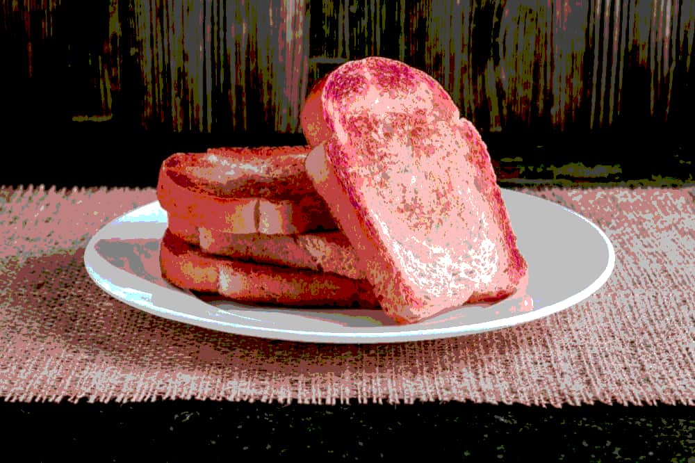
This guide was written for you by the toast pirate! Dream of me and ye shall find toast at the end of your voyage!
This example was stolen borrowed from the template made by Melon
See what I mean ? See how much place this takes, just for some obvious goofy over-detailed recipe of Toast ?
Here's another one just for fun (and maybe because I know the recipe)
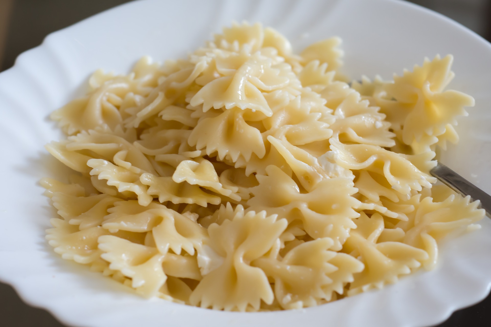
How to make pasta:
I recently learned that it is possible to put pasta in a magic box and thus doing so it can be found to be the case that indeed! Pasta! PASTA! Its born from the box, its created from that firefly shadow realm of grooves and grids. My guide leads your forth, it shows the way to the pasta and tells of times that may yet come.
Basic Pasta steps:
- Acquire water from the tap and store it in a cooking pan
- Place the pan on the stove, and turn it on a max power
- Place a lid on the pan
- If you have made it this far, you can go stare at the window for a few minutes
- As a friend once said, it's good "when there are bubbles", then you add a random amount of salt in the boiling water
- Acquire pasta from the place
- Insert the pasta into the pan
- IF THE PREVIOUS STEP DIDN'T WORK : TRY REMOVING THE LID FROM THE PAN
- Wait for the amound of time indicated on the package (careful, I once overcooked some pasta from a different package, thinking the time would be the same)
- Perform an extraction of the pasta molecules from the aqueous solution
- Store the pasta on a plate, and add whatever your heart wishes to add
- eat.
Pasta - an example (sadly these aren't mine...):
If you prefer rice, or spinach, you can put mom's signature recipe (or your own) and share it to your online neighbors.
Recipes are just an example of what you can (should) put (I think Melon really wants Bob's almond tart recipe). Here's an uncurated list of things that fill space in a good way
- Recipes
- Goofy images and gifs (see the Museum Of Modern Gifs for an unlimited amount of public domain gifs)
- Random facts, about you, about stuff you know about (yes you do know sutff)
- Random quotes you like, or quotes that define you
- Links to your friends' and online neighbors' webpages
- Stuff you have made, like articles about stuff you wrote, showing off that cool computer magic thingy you've made work, that song you've composed (please send me the guitar tab hehe)...
- ...
No way ?! Examples !!
mesoscale - This one illustrates several point wow
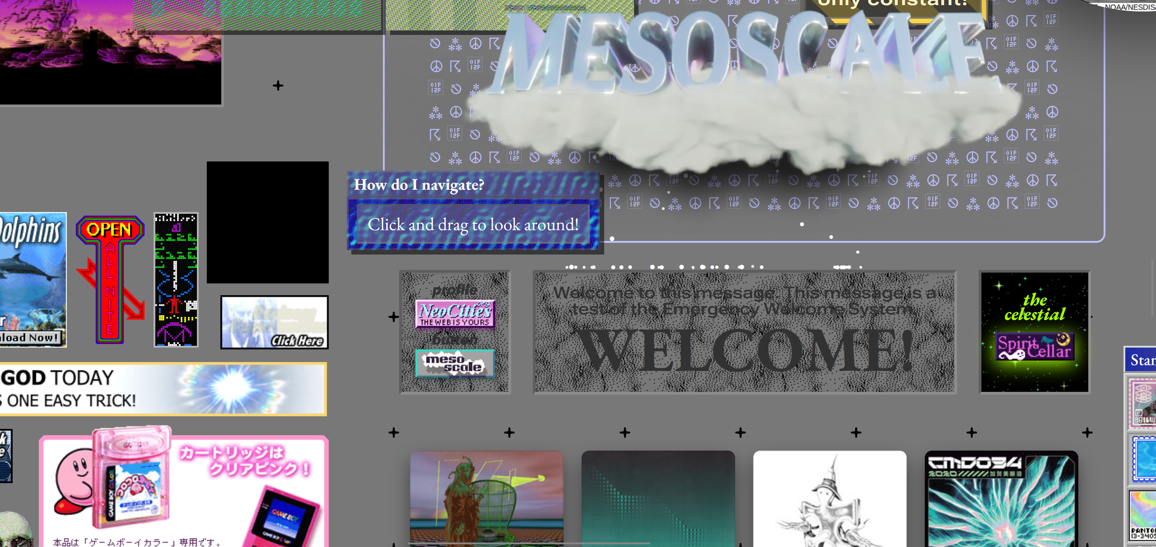
Here you have gifs, songs at the bottom, links to other people !!
Ratakor's website - He's a friend of mine !
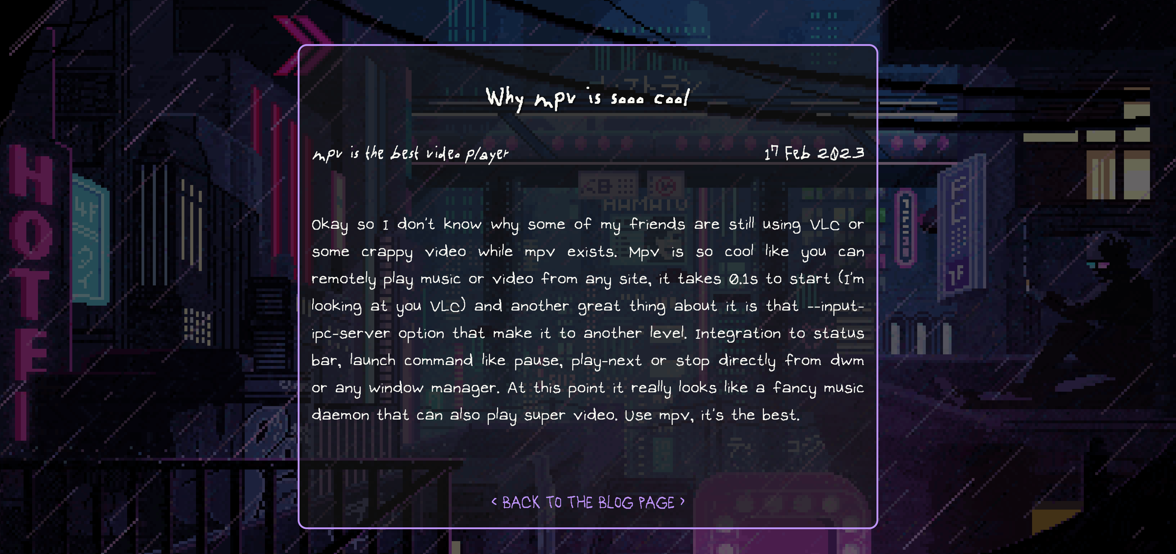
Here's an example of an article you could publish on your website (google rss feeds)
Leaving blank spaces - How ok is it ?
Let's first take some examples:
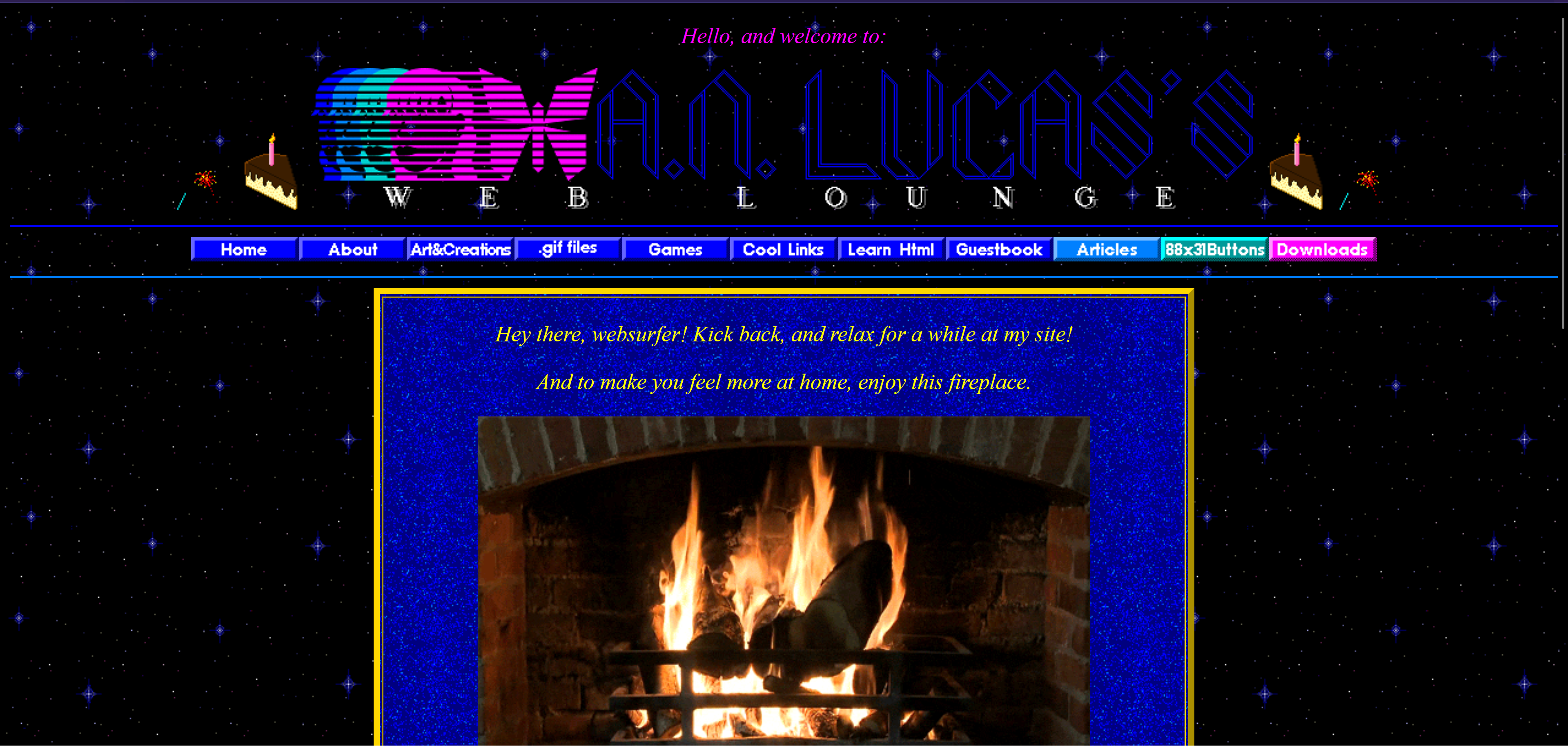
Ibanez' website
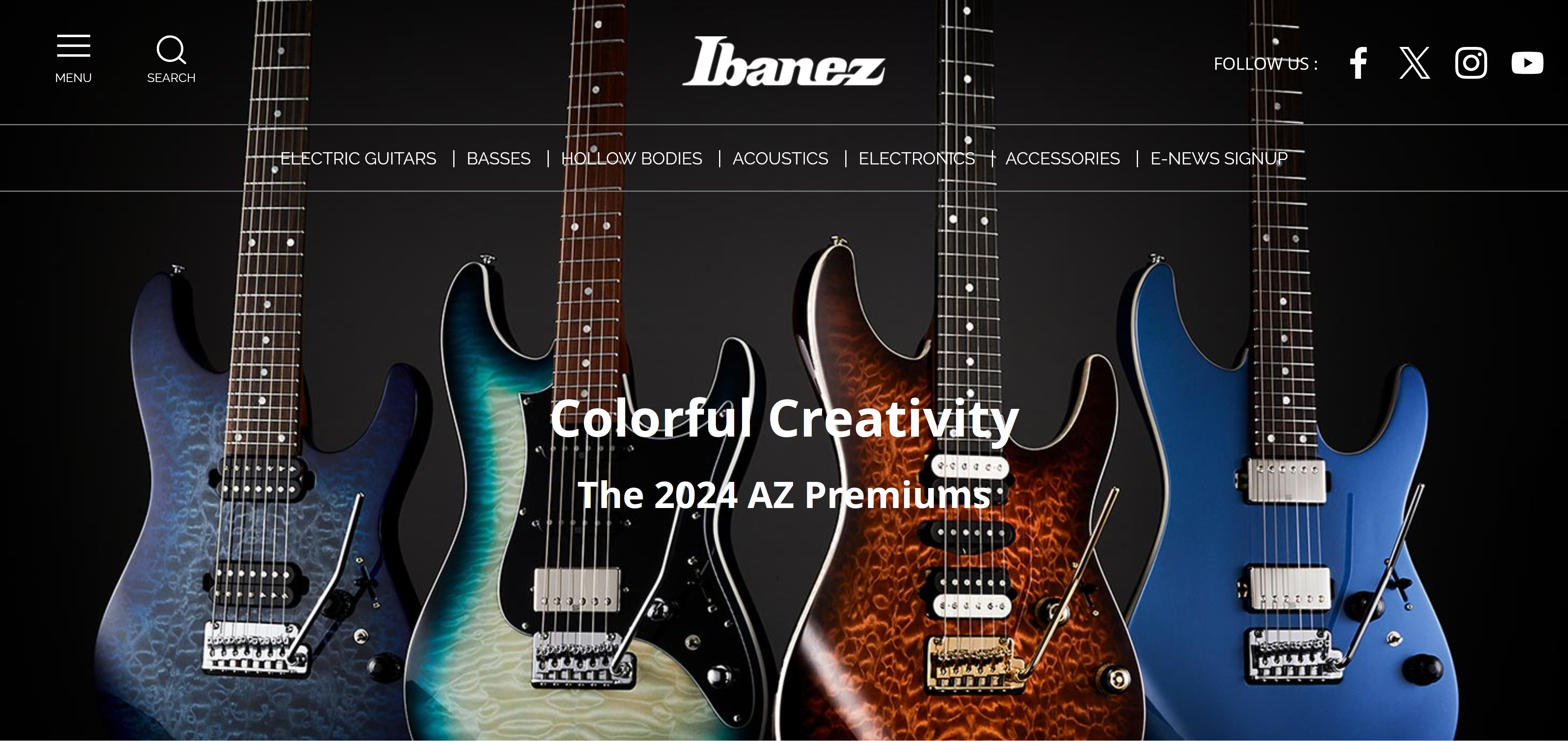
I really like Ibanez guitars, but wow, their whole website just feels haughty and it feels like it's looking down on you. This make sense for me at least. This image is what you see first when accessing the website: your sight is drawn to the zooming picture of the instruments, HEY LOOK HERE'S A PRODUCT YOU SHOULD BUY, just a quick vague description of what you'are looking at, but then that's all, you've already forgotten what you had came here for. I hope I don't make it sound like I'm insulting Ibanez, but their website falls into the stereotype of a big company advertisement.
Benny's website
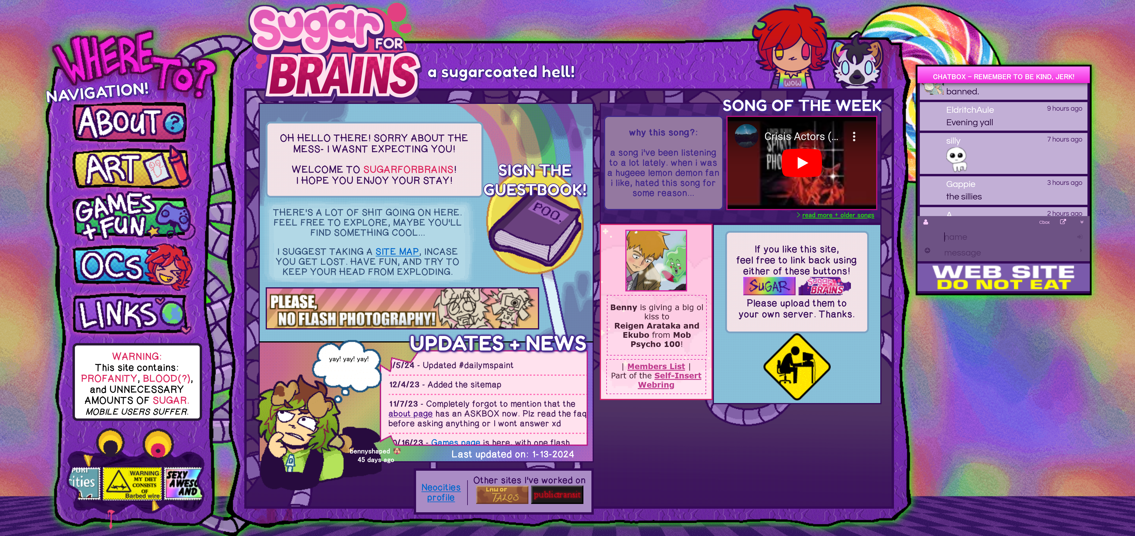
This one is a good example of filling space with content, and if you look closely, there are a few paragraphs but still tons of texts. The place looks a bit compact, but so welcoming at the same time. Like of course you're gonna tell me the styling and design and colors and stuff do a lot, but most of it is text.
I think the answer to "How much 'blank' space should there be ?" is debatable. Generally speaking, there seems to be a tendency for big company websites to use some rather simplistic designs, prefering some big empty pages with few huge texts and plain backgrounds, but I don't know, there's something wrong and unfriendly to it. On the contrary, if your website is supposed to be an expression of yourself, you wouldn't want the place to be mostly empty. Always keep in mind that this space is you, so the process of building it is complex and the result tells you and the others about yourself.
About background contents
While it shouldn't represent the major part of what catches the eye, your background - be it colors, image(s), gif(s) - gives the general colorscheme of your page (mostly, but this is about styling), and fills space in its own way. This way you can exploit your page's background to fill in space, but always keep in mind what you want that general description of you to feel. This is kind of like what your wallpaper says about you
About side blanks
Side blanks are everywhere, like just look at a random page listed on neocities and there'll be side blanks :
You get the point. While it kinda feels like unfilled space (obviously as long as you don't overdo it), using thse side blanks unpacks your page, and makes it more readable, while concentrating content on one part of it (easier on the eyes). Plus you can add some goofy gifs in this newly allocated space ! This brings us to the next point: It is ok to leave blank spaces.
Why it's okay to leave blank spaces - And why it's supposed to take time
As said above, leaving unfilled space is ok, if you chose a fitting background, you can leave empty space and free your page of packed together content and unreadable sections. Example:
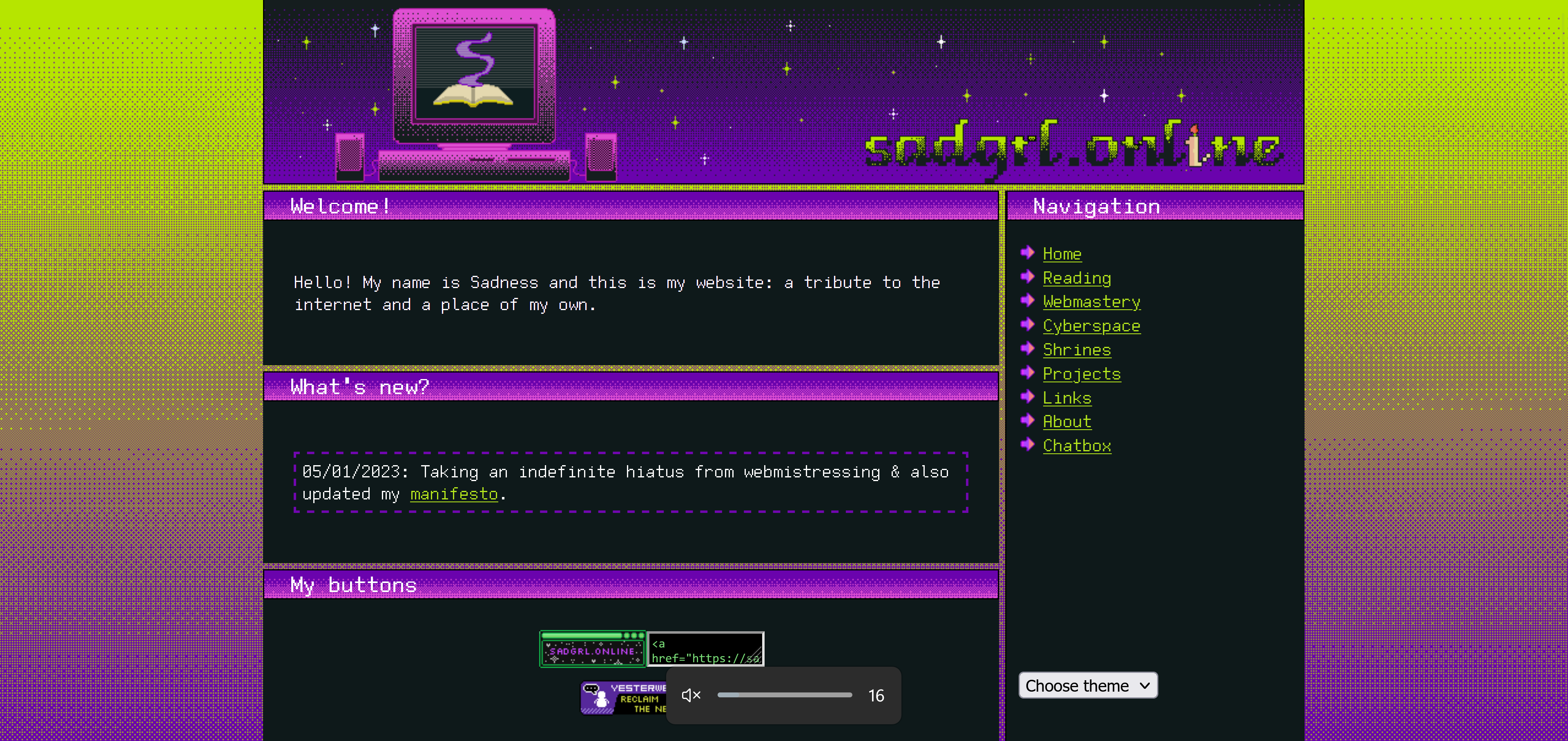
Ch4d's page
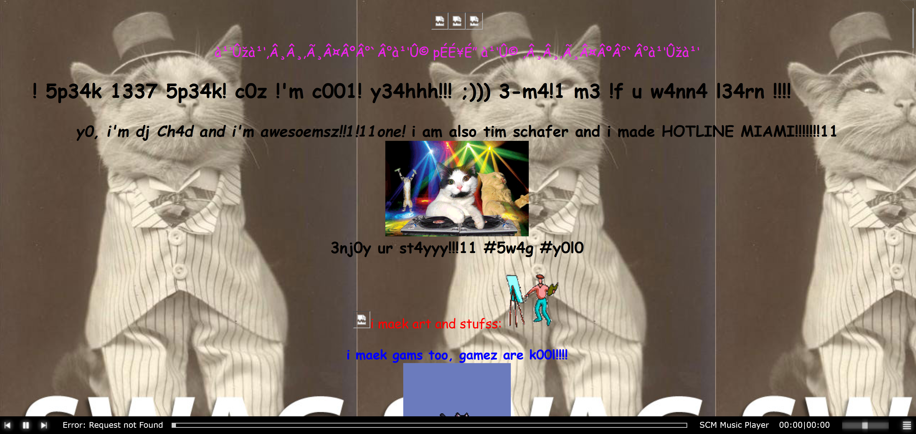
So this one's insanely goofy but see how much empty space there is and how un-empty this feels ?
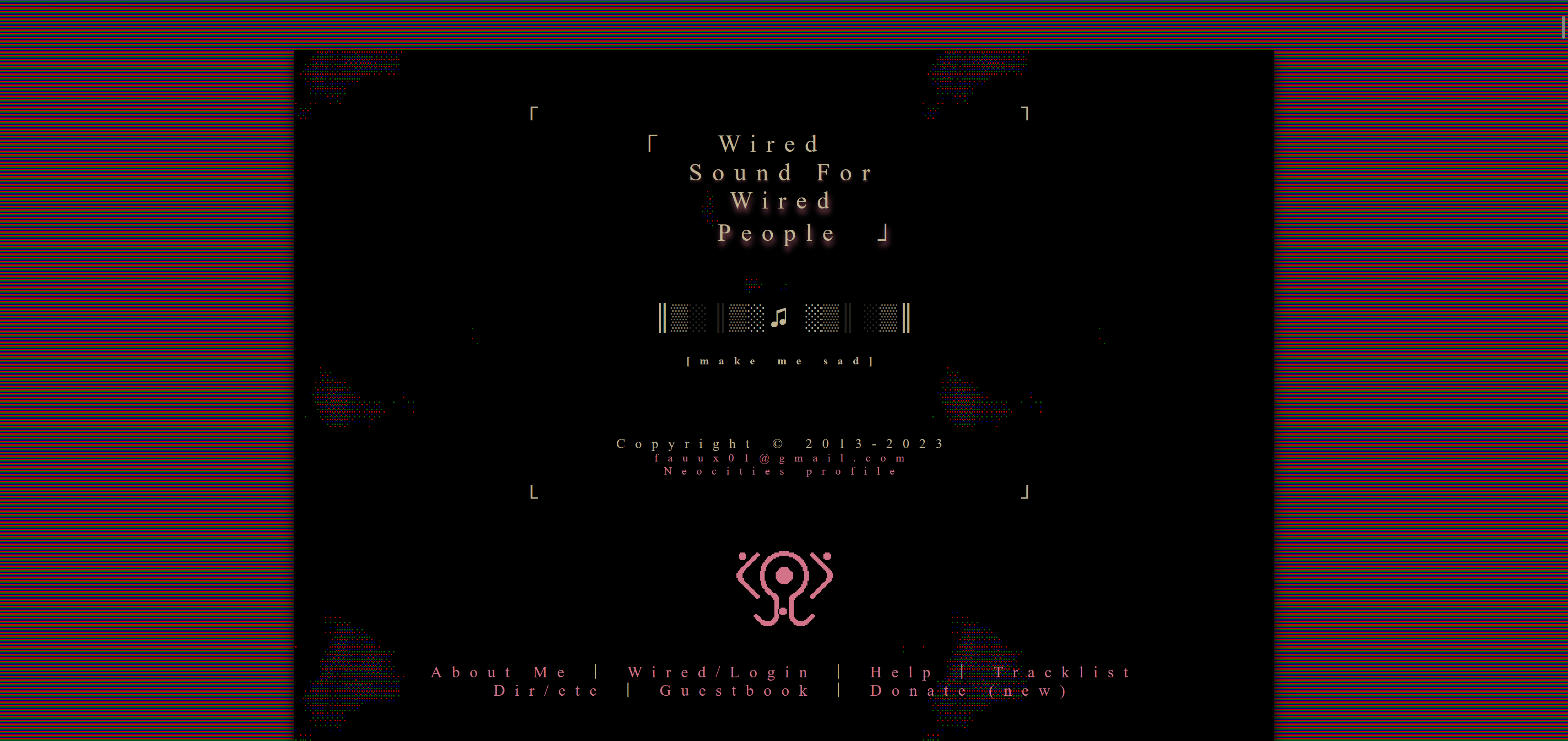
Castor's page
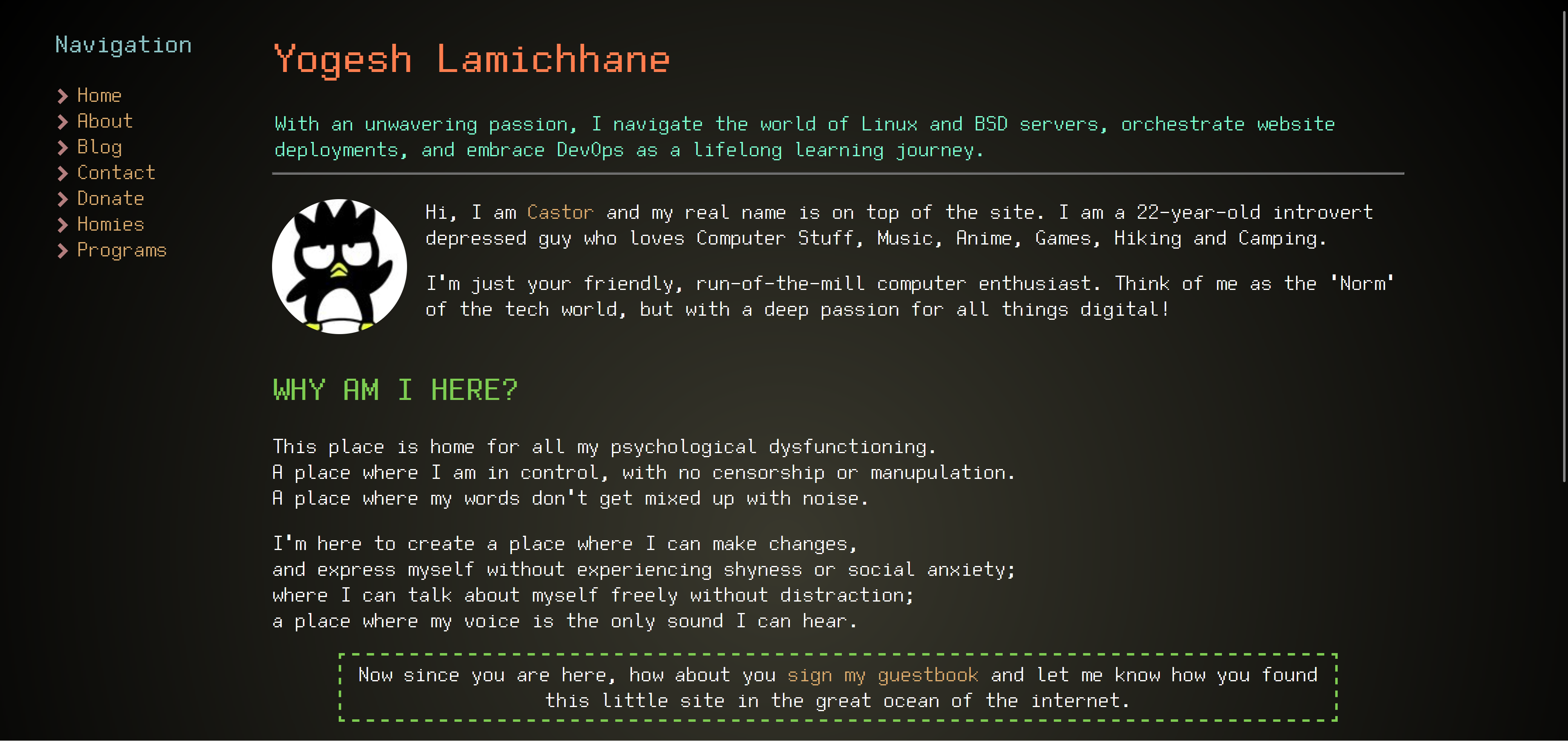
Again, but more serious this time, notice spaces left and how normal it feels.
With those examples, you see that 'real'/relevant content isn't that important if you can substitute with useful blanks.
In addition to all that, remember that Rome wasn't built in a day, and so won't your page. Remember that this page is yours, this space is yours, this space is YOU, can you imagine if you had to build yourself first try ?? Can you imagine defining yourself and sticking and relating to that description of yourself forever ? I know I couldn't, and I'm glad there's room for improvement, modification, fine tuning, adjustments, completely starting over if want to ! And more than that, I know there's time.
Conclusion - Was I good ?
To finish off this article, I want to emphasize the important points: Always keep in mind that the content of your website is what represents you, this can serve as a guideline when you are creating it. How you fill space also illustrate how you exist and how you think, so take that into account. Because this is yourself you are painting on that canvas, I do think that matter should come naturally/instinctively, and that it may will take time. More importantly, the content of your website is supposed to evolve over time. This space might bring you to a new judgement of yourself, so be ready to accept this vision of yourself.
This is a lot of serious talk but most of all, just take it easy !
- Marcellus